
Sketch Bootstrap UI Kit is a collection of 300+ Bootstrap 5 components built with Atomic Design System and Smart layouts. You can easily start your next Sketch project by dragging and dropping pre-made components from the Asset panel. Keep reading to learn more:
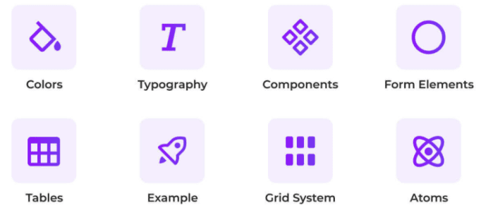
For designers, developers, and any Sketch user who needs the components for their projects. Find from typography to elements and tables for your resources. Some of the available options this collection offers:
With this feature you can easily and quickly create a website or application, saving you time and money.
As easy as that. Resize any components horizontally or vertically like a pro!
It is a ready to use, organized component set that includes a consistent naming convention, which allows you to search and import with ease.
Layers and groups are made to match the Bootstrap class names, and components are arranged exactly as specified in the Bootstrap documentation. With it, you have the ability to enhance your workflow between designer and developer, and stay ahead of the competition.
In Sketch Boostrap UI Kit you are able to easily customize colors, typography and border radius for a clean and consistent presentation everywhere through instant change. The component can also be quickly updated regarding its state, which is quite useful.
This Sketch Bootstrap UI Kit is a powerful and easy-to-use library for Sketch that consists of components and atoms organized by category. Furthermore, it includes some of Bootstrap's colors, grids, and typography, so that you can quickly and easily customize it for your brand or product.
Check the demo here.
Continue reading: